Midterm Reflection: A Brief Check-in

Reflecting on the course work of this semester so far, I can honestly say that I have learned many things regarding digital elements and how to use them. From writing HTML/CSS and webpage development to creating maps and storylines, I have expanded my knowledge exponentially. Regarding my WordPress site and webpage, I have streamlined everything. For instance, my Dashboard has had the Quick Draft and Welcome sections removed to avoid clutter, and I have the Activity and News sections right at the top. For my own personal webpage, I have added a new color scheme centered on blue. I added a new image about states’ rights on segregation during the Jim Crow era and I changed the section format, giving it a new flair that pops. These changes reflect my personality by being precise, neat, and organized. I do not like an overload of visuals and information, but I am a visual learner, so I am always trying to find a balance between the two.

Throughout the semester, we were required to make and publish numerous blog posts. One that I am particularly proud of is the “Exploring Safari” post. This post was about the Smithsonian’s exhibit on military aviation and reconnaissance and since I plan to purse a professional career as a pilot, this topic interests me heavily. I learned how digital elements can really influence not just public perception, but military strategy and geopolitics. I even learned that early military aviation set the groundwork for private airline regulations and guidelines. Making this post was not just interesting, but fun. It almost made me forget that it was schoolwork. Link: https://jweiss451.com/blog/exploring-safari/

This semester, we created a webpage using HTML/CSS and this skills assessment was by far my favorite. I learned so much and I learned how to search for code that I did not know. I found several websites that help with HTML and CSS. This website was used to make an exhibit about The Green Book, which was a navigational aid used by Black patrons to travel safely through the segregated South. This assessment stood out to me as a milestone because I did not know anything about webpage development, and I am going to use this website and the knowledge I gained to make a personal website for my aviation career in the future. Link: file:///C:/Users/jacks/Desktop/HTMLCSS/index.html

I would like to expand on my HTML skills and web development, and I would like to go back and revise my Timeline. The timeline skills assessment was a little confusing to get the hang of and I feel like I rushed it to meet the deadline. I want to go back in and take my time with it, and it behooves me to do so because I plan to use it as a digital element for my final project. I have done loads of research on my topic and feel confident with the knowledge I have on it already. Overall, this semester has been a good one. I have enjoyed this class so far and I can honestly say that I will use the digital elements in the future for various things regarding school and work.

Mapping History

The mapping projects that I created using StoryMapJS and Google Maps were awesome tools to help me visualize my research for my project. Having to look up and find sources for the individual points when making the maps proved invaluable. Not only did I find new primary sources, but I also found new techniques to help me when I’m conducting my research. I made my maps on political polarization in America starting with the 2000 Presidential election and moving forward to the Trump era in the present-day. A challenge I faced was deciding what to map out. This topic does not necessarily have specific locations for certain bullet points, like when Elon Musk bought Twitter in 2022. I simply used the Twitter headquarters in San Franscico, California as the location for that part. This is a topic that is very relevant, and I have already done tons of research on it, so I did not learn that much about the topic itself, but I learned solid ways to map out my bullet points.

            The StoryMapJS was a helpful tool that imposed a learning experience. Having to put all my topics in sequential order was eye opening on how I wanted to write about my topic. Using the images, I was able to walk through how I wanted to portray my ideas. I ended up running into trouble when it came to how I wanted to describe the various presidential elections and Elon Musk buying Twitter.

On the contrary, the Goole maps was like StoryMapJS, but the user interface was a little trickier and it ended up taking me longer to complete. The different non-linear format of Google Maps reinforced my thought process for how I wanted to portray my project. The different layers of the software were interesting, but unnecessary for my topic of political polarization because it is so streamlined and doesn’t focus on specific locations. I did, however, have to come up with additional points to satisfy the requirements. All in all, I enjoyed using Google maps more than StoryMapJS.

When physically mapping history, it forces you to garner an objective perspective and seek information you wouldn’t find normally. It requires you to get out of your comfort zone and push yourself. This causes you to come up with ideas that you normally wouldn’t. Another aspect that these maps make you think about how spatial history challenges and reinforces historical assumptions by shifting the way historians analyze and interpret the past, emphasizing space, movement, and geography in ways that can expose new patterns or complicate established narratives. This exercise was a phenomenal way to touch up on my digital elements skills and help me think outside the box in regards to how I want to portray my project.

StoryMapJS Link: https://storymap.knightlab.com/edit/?id=hist-390-storymap

Goole Map Link: https://www.google.com/maps/d/u/2/edit?mid=1XfBifv-DyoaRHU1ry3nCdjuO34ghB6g&ll=1.730113837851711%2C0&z=2

Museum Assignment

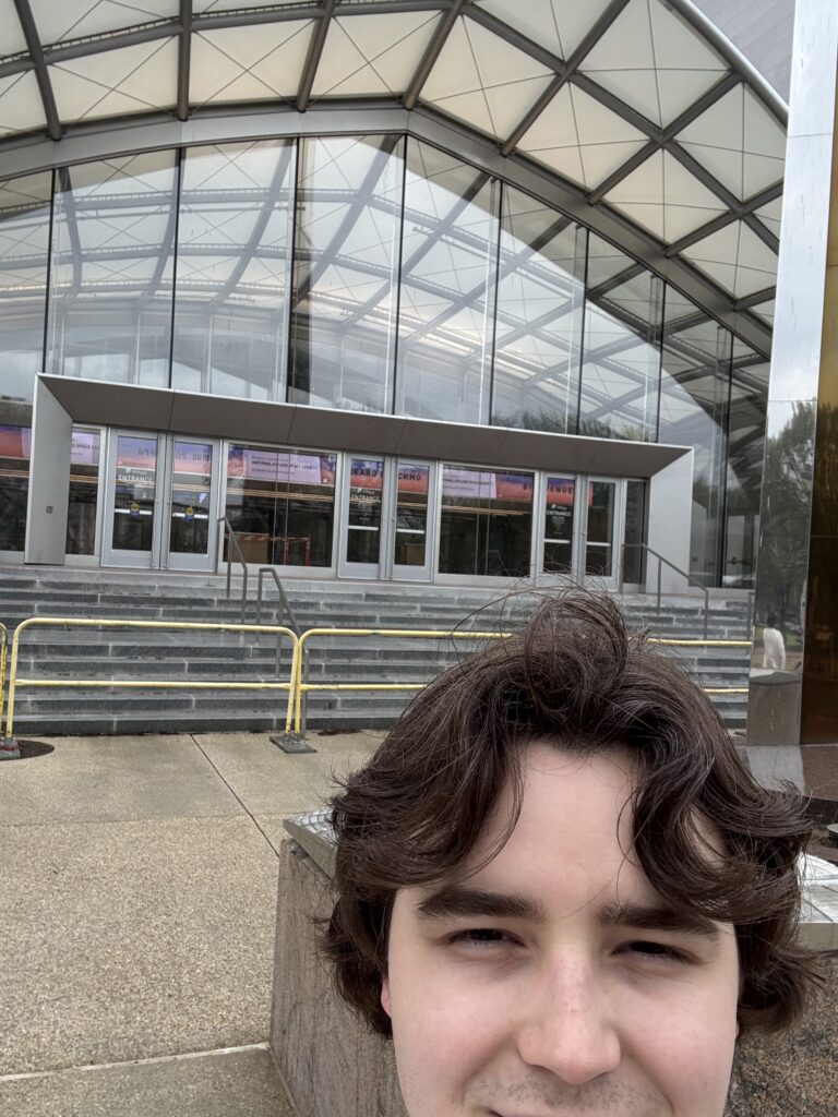
            For this assignment, I went to the Smithsonian National Air and Space Museum in Washington DC. I have been to this museum numerous times as a kid, and each time it was amazing. I chose to do the “Modern Military Aviation” exhibition for this assignment because aviation is incredibly fascinating to me. I plan to become a professional pilot and this type of exhibit is right up my wheelhouse. From discussing early inventions in aviation and aeronautics to tackling the challenges of space flight and exploration, this exhibit went into detail about the desire of America to be at the forefront of aviation and the prestige of space flight. Being in the nation’s capital, the Air and Space museum is in the perfect place for tourism and many defense contractors conveniently located across the Potomac near the Pentagon.

            The purpose of the exhibit is to deep dive into the history and inevitable goals of military aviation. My dad was an Army pilot and walking through the exhibit, I was able to pinpoint certain topics that I understood from knowledge passed down to me by my Dad. The exhibit is very educational and discusses how military aviation led to the technology that is used in drones, missiles, and rocket propulsion. It goes back in time and touches on some of the first ever aircraft used, such as the introduction of helicopters in Vietnam and special bomber jets built for nuclear capabilities during the Cold War. There are numerous interactive displays and activities littered throughout the exhibit that make learning the material fun.

            The technology used within the exhibit enhances the experience and learning ability for everyone. Each main showcase had a touchscreen display that gave all sorts of information and data of whatever was being shown. There was an interactive game played on a touchscreen table for children and live models explaining the technology behind helicopters. All the digital elements were easy and fun to use and they added excitement for all ages. The exhibit was easy to navigate and anyone with movement disabilities would have no trouble getting around. There were not any sensory aids for blind or deaf people, but that is something that the museum can improve on. All the information was written and spoken in English, but there were options for audio recording in other languages for tourists. Families with children were the primary clientele of the museum and there were not any free programs for underserved populations.

            The layout of the exhibit flows seamlessly between the technology base and time period. It starts with a nice overview of advanced technology to draw you in, and then it branches off into different eras starting at WWI and WWII and going all the way to the present day. Artifacts like parts of aircraft and uniforms of pilots wonderfully accent the main displays. The dark overcast of the setting makes you feel like you’re in the cockpit of a fighter pilot or deep in the ocean on a submarine. You genuinely feel like you are in the military. The experience is a solo one without much interaction with other visitors. It is a blast you will never forget.

            The “Modern Military Aviation” exhibit at the Smithsonian Air and Space Museum was a phenomenal experience that I would highly recommend for everyone. My experience helped me learn that interactive displays and games are a terrific way to get people interested in things that they normally wouldn’t be. Using digital elements is wonderful method to influence the public and educate the masses. This experience was a blast of nostalgia that reminded me of when I was a kid, running through the museum with my sister and my dad.

References

“Modern Military Aviation.” National Air and Space Museum, 31 Jan. 2024, airandspace.si.edu/whats-on/exhibitions/modern-military-aviation.

Telling Time with TimelineJS

The Effects of Twitter and Social Media on Political Polarization

If you’ve ever scrolled through Twitter during an election year, you’ve probably felt it, that intense, often hostile energy that seems to divide the internet into two camps. It’s not just your imagination. Social media, especially platforms like Twitter, has played a significant role in deepening political polarization in America. For my digital art history project, I decided to explore this through a timeline that visualizes key moments in modern political division, starting with the 2000 presidential election and ending in recent years.

I chose this topic because I wanted to understand how online platforms, which were originally designed to connect people, have increasingly become spaces that drive them apart. Timelines matter because they don’t just show what happened, they show when it happened, which helps us recognize patterns and turning points. In this post, I’ll walk you through how I built the timeline, what I learned from the process, and how using a visual tool changed the way I think about history and media.

Behind the Scenes: Building the Timeline

Choosing What Matters:
I included twelve events in my timeline. The process of selecting them wasn’t as straightforward as I expected. I didn’t just want to list major political events, I wanted to focus on moments where the political divide seemed to deepen, and Twitter or social media played a part. I started with the 2000 election (Bush v. Gore), which I see as the start of modern polarization. From there, I picked moments like Obama’s election, the rise of the Tea Party, Trump’s campaign and presidency, and the events of January 6th. Each event felt like a step deeper into political division, and choosing just eight meant leaving out a lot of others that were also important.

Overcoming Roadblocks:
The biggest challenge for me was figuring out how to actually use TimelineJS. I’d never worked with it before, and getting everything to look right, images, dates, formatting, was a bit of a headache. I ended up watching a bunch of YouTube videos and reading through guides before I got it working. It wasn’t exactly intuitive at first, but once I got the hang of the Google Sheets template, things started to click.

Bringing History to Life with Multimedia:
I wanted the visuals to do some of the storytelling. I used election maps, photos of political figures like Barack Obama and Donald Trump, and screenshots of viral tweets. These images helped show the emotional tone of each moment and made the timeline more than just a list of facts. Text can explain something, but a picture of a red vs. blue map, or a tweet that went viral, can show how people were feeling at the time. That emotional layer felt important.

Accuracy & Storytelling:
One of the trickier parts was deciding how to tell a story without slipping into bias. The timeline reflects my interpretation of events, but I tried to stick to facts and keep things balanced. Still, I noticed how easy it is to shape a narrative just by choosing what to include and how to phrase things. I also thought about what voices were missing, how certain communities or perspectives might not be captured in the mainstream sources I used.

The Tech Side:
TimelineJS was frustrating at first, but honestly, it grew on me. It forced me to think about history in a new way. I couldn’t just write a paper, I had to think about what people would see, in what order, and how each slide added to the overall arc. The design made me think more visually and strategically, which is different from how I usually approach school projects.

The Big Picture: How Timelines Shape History

Timelines are powerful because they suggest causality and progression. When you put events in a line, it naturally makes people think one thing led to another, even if the connection isn’t that direct. I noticed that some events seemed more important just because of where they landed on the timeline. For example, by placing the rise of social media between Obama’s election and Trump’s campaign, it almost tells a story by itself, without needing much extra explanation. But timelines also leave things out. They can’t capture nuance the way an essay or documentary might. You don’t get as much space to dig into context or conflicting viewpoints. That’s something I had to keep reminding myself, that this is one version of the story, not the whole story.

Final Thoughts: Lessons Learned

Making this timeline definitely shifted how I see the topic of polarization and social media. It made me think more critically about the power of platforms like Twitter, not just to reflect public opinion, but to shape it. It also gave me a new appreciation for digital tools in history education. In fact, I liked it enough that I’m planning to expand on this project for my final assignment. If I were to do it again, I’d probably spend more time upfront planning the visual flow, how one event leads into the next visually as well as thematically. And for anyone else using TimelineJS for the first time, be patient, watch tutorials, and don’t be afraid to experiment. one event leads into the next visually as well as thematically. And for anyone else using TimelineJS for the first time: be patient, watch tutorials, and don’t be afraid to experiment.

Exploring Safari

In the modern world, where technology often intersects with art and history, digital exhibits offer a fascinating new way to engage with and understand complex subjects. One such exhibit, hosted by the Smithsonian National Air and Space Museum, delves into the digital art history of military reconnaissance. This exhibit uniquely bridges the gap between military history, technology, and visual culture, offering a digital platform that invites users to explore how art and surveillance have evolved together, especially through military applications.

Digital art has long played a pivotal role in military reconnaissance, often serving as both a practical tool and a form of visual documentation. The exhibit explores this dual nature, displaying how aerial imagery and satellite surveillance have influenced military strategies, global politics, and even the development of artistic styles. The visual representations of reconnaissance missions, whether through traditional photography or digital media, capture not just the terrain but also the human element of warfare, highlighting the profound impact of these technologies on both soldiers and civilians.

By incorporating digital art into the storytelling process, the exhibit provides an immersive experience that brings historical events to life. Digital tools allow for greater detail and accessibility than traditional exhibitions, presenting a broader spectrum of visual materials and interpretations than would be possible in a physical gallery setting.

The Smithsonian’s exhibit is built on a foundation of well-researched sources, ensuring its historical accuracy and credibility. The project uses a mix of both primary and secondary sources and most of the sources come directly from US Army and Air Force aviation programs. The digital exhibit pulls from a vast collection, with sources ranging from military photography to satellite imagery, as well as artistic depictions of reconnaissance missions. Since the Smithsonian is a highly reputable institution, their sources are high-quality and come from subject matter experts in their respective fields.

However, one key challenge with such digital platforms is the potential for interpretation. The line between artistic representation and historical documentation can sometimes blur, making it essential for viewers to critically assess the content presented. For instance, the project mostly views aviation through a white male lens, so the focus and perspective come from a more narrowed view. While digital art offers new perspectives on history, it is vital to recognize the difference between artistic interpretation and the factual data that forms the backbone of military reconnaissance.

The design and user interface of the exhibit play a critical role in how viewers engage with its content. In this case, the digital platform includes interactive elements that are easy to use, allowing visitors to zoom in on images, explore 3D reconstructions, or access additional context through embedded multimedia. For a digital art history exhibit focused on military reconnaissance, the interface strikes a balance between complexity and accessibility. It caters to both casual visitors who may have little background in military history and more seasoned researchers who want to delve into deeper layers of analysis. The interactive maps, time-lapse sequences, and high-resolution images of reconnaissance missions offer an immersive experience that allows viewers to engage with the content in a more personal and meaningful way. The aerial shots of the beaches of Normandy on D-Day illustrate this phenomenally.

The role of digital exhibits in public history is profound. Public history seeks to engage the public with historical narratives and bring history out of academic spaces and into everyday life. The military reconnaissance exhibit does this by making complex, technical subjects accessible and engaging to a wide audience. Whether someone is interested in the military, technology, or art, the exhibit offers something for everyone, while also encouraging deeper exploration of the ethical, political, and social implications of military surveillance.

Digital platforms make history more accessible to the masses, breaking down the barriers of location and physical accessibility. With this exhibit from the Smithsonian, anyone with an internet connection can engage with the rich history of military reconnaissance, exploring its evolution and impact on contemporary conflicts. The interactive nature of the exhibit also allows for a more personalized learning experience, helping users to connect with history in ways that are meaningful to them.

Moreover, this digital art history exhibit can serve as an educational tool for students, scholars, and military professionals who wish to understand the intersection of art, technology, and warfare. It creates a space where historical events are not just presented as facts but explored in visual and interactive formats, encouraging critical thinking and a deeper appreciation for the complexities of military reconnaissance.

The Smithsonian’s digital exhibit on military reconnaissance art history is a stunning example of how digital platforms are revolutionizing the way we engage with history. By blending military history, technology, and digital art, the exhibit offers an engaging and educational experience that appeals to a broad audience. The use of credible sources ensures historical accuracy, while the innovative design and interactive elements make the exhibit both accessible and engaging. Ultimately, this exhibit plays an essential role in public history, offering a unique lens through which we can understand the past and its ongoing impact on the present.

Link to project: https://airandspace.si.edu/explore/stories/military-reconnaissance


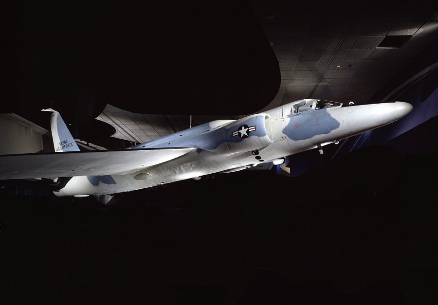
Lockheed Martin U-2C, an early reconnaissance aircraft.